Monday, February 29, 2016

Activity 4: Geodatabases, Attributes, and Domains

Introduction

In this week's assignment, I was to create a geodatabase that would in turn be deployed in ArcPad. This geodatabase will be used to create a microclimate map which then will be a part of an activity down the road. The geodatabase needs to contain various data for each point taken in the field. These data attributes include: temperature, dew point, wind speed, wind direction (cardinal and azimuth), group number, relative humidity, and the most important being an attribute for note taking. It is important to create a good geodatabase with valuable domains before heading out into the field. Having domains allows for easier and quicker data collection as well as reduces the potential of incorrectly inputting values for different attributes. This activity also helped to be able use ArcPad to collect different data for the micro climate around campus and to import that data into ArcMap. It is important to properly create a geodatabase because an activity such as collecting micro climate data is supposed to take as little time as possible as to avoid discrepancies in the data due to temporal variances. It is also important to practice good normalization as to avoid problems and headaches when manipulating data back in the lab.

Part 1

The first step is to get ready to create a micro climate geodatabase. In order to do so, one needs to plan ahead and figure out the attributes that are required or important before heading into the field. It is crucial to have the proper tools and a Trimble Juno GPS unit (figure 1) is one of the most important tools to have for a project such as this. This allows for a geodatabase to be uploaded to the mobile device and allows for data to be collected and surveyed on the fly in a more or less mobile version of ArcMap. As mentioned before, it is important to plan ahead and figure out the different attributes that are important to collect to get a nice understanding of different microclimates. For this activity, it is important to understand what a microclimate is. A microclimate is a small restricted area that varies in temperature, humidity, wind speed, etc. (climate) of another climate or area nearby.


figure 1: The Trimble Juno GPS unit that will be used for data collection later on. 

Part 2

Step 1 - Construction of a Geodatabase

This is probably one of the fastest steps of the whole process. I first had to go into ArcCatalog and create a new file geodatabase in a folder I created. Now my geodatabase was created (figure 2).

figure 2: The new geodatabase named 'mc_hagenjc.gdb' that will be used to collect and analyze the data from this project

Steps 2 & 3 - Development of Geodatabase Domains/Development of Domain Ranges

This step is very important because it helps save time and reduces the chances of making user errors when inputting values, as mentioned before. By looking at the data that will be collected, one can determine what the domains (a set of rules assigned to a given attribute) and ranges will be set as (figure 3). For example, temperature was given a range of 15-60 degrees Fahrenheit so values that lie out of this range will not be recorded. Coded values were also used for wind direction, so recording an N would imply that the wind direction was north, and SW would imply southwest. It is good to observe the attributes you decide to collect as well as when and where they are collected. It would be cumbersome and possibly problematic to set a range of -50 to 150 for temperature in spring because temperature will most likely not reach a value near -50 or 150. That is why I chose to use a range of 15-60 for the time of year I would be collecting data. When creating domains, it is important to create a description in order to know exactly what the domain is, especially if you decide to abbreviate domain names. On top of that, the knowledge of data type must be understood. For instance, what implications short integer, long integer, float, and text have on the data being collected.

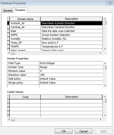
figure 3: Example of a domain name, description, field and domain type, and domain range
Step 4 - Construction of a Feature Class for Later Deployment in ArcPad

After the domains have been created, it is time to create a feature class. A feature class is collection of features that all have the same spatial representation such as a point, line, or polygon and a common set of attribute columns. For this activity, a point feature class was created with a UTM zone 15 projection. It is important to note that only one feature class should be created, otherwise you would have to filter through numerous feature classes in the field for each attribute.

Step 5

I decided to add another step by importing an aerial basemap of the study area. The basemap should be zoomed in to the desired area to avoid pixilating the image as well as to prevent the Trimble from taking a long time to buffer the image. I figured having a basemap would help for easier navigation around the campus and to make sure I was in an accurate location on the map as compared to the field.

Discussion

It can be easy to create a geodatabase if you know what you are doing. But it appears you can potentially run into a plethora of problems such as using a short integer when a long integer is required, or not properly setting a domain range. These types of errors can easily be avoided by planning ahead for the project and determining best practices ahead of time. On top of that, human errors can also occur in the field so that is one importance of setting domains to combat those user errors. It is hard to keep in mind to use best practices to make data interpretation not only easy for yourself, but also for other people who could potentially use the data you have collected. So I have been trying to keep in mind to write out detailed descriptions and try to make sure that another person could understand my data and use it without running into problems that could have easily been avoided if I were more careful and conscientious in pre-planning.

Saturday, February 20, 2016

Activity 3: Development of a Field Navigation Map

Introduction

The purpose of this lab was to become familiar with being able to produce an aesthetically pleasing and practical map which will later be used to navigate a course set up in the end of April. The course is going to be located at the Priory which is a parcel of land owned by the University of Wisconsin - Eau Claire at the outskirts of the city. The map needed enough information for navigation purposes and at the same time it could not be too cluttered or contain too much information to make navigating difficult or cumbersome. One of the objectives of this lab was to create two different navigation maps to learn first hand which type of map is easier to use. The first map is based on the Universal Transverse Mercator (UTM) Zone 15 North (figure 2), and the second is based on the Geographic Coordinate System (GCS) (figure 3).

Methods

There were two activities for this week's lab assignment. The first was to determine our personal pace counts. To do this, we counted the number of steps we took with our right foot across a distance of 100 meters. My pace count was 59 and this information will be used in the actual activity of navigating through the study area.

The second activity was to design two navigation maps; one with a 50 meter UTM grid and the other with geographic coordinates in decimal degrees. These were the only requirements given, so the map design was entirely up to our own discretion.

I began to create the UTM map. In order to design the map, I imported a basemap that contained background aerial imagery given by Dr. Hupy. I then pinpointed the location of the Priory and fit it to the data frame. Next, I changed the coordinate system to NAD_1983_UTM_Zone_15N and added a UTM grid set at 50 meters. After the grid was set, I looked at some data that was provided by our professor. There was a 2 foot contour interval and a 5 meter contour interval so I initially tested out the 2ft interval and noticed that there was too much clutter to be able to successfully use the map so I decided on the 5m interval. I played around with colors, grid number sizes, etc. in order to minimize the clutter but at the same time to display the map properly. A DEM was also provided by the professor, however I felt more comfortable with using an aerial image for proper navigation over the use of a DEM. The aerial image seemed to bold so I messed around with the transparency, contrast, and brightness and found a happy medium by only using a 40% transparency. I also played around with how much area I wanted to show outside of the Priory and how to position my legend and decided on leaving little to no extra space around the priory and to put the legend on the outside of the map instead of overlapping the map itself. After this I noticed I had no clue of the elevation of the contour lines so I decided to add labels based on the contour intervals to hopefully make for easier interpretation of the map.

I followed this same process to create a Geographic Coordinate System map, with a few slight adjustments to account for differences between GCS and UTM coordinates.


Figure 2: The Priory with a UTM 50 meter grid
Figure 3: The Priory with a geographic coordinate system measured in decimal degrees
Discussion

I was surprised at how much difference there was in the map's shape based on the coordinate system used. The UTM map has more of square shape to it but also appears to be more 'skewed' or tilted in the data frame whereas the GCS map is more of a rectangle. But at the same time, the GCS map appears to be more distorted than the UTM. So based on that observation, as well as the fact that UTM maps provide measurements in meters rather than degrees (which allows for easier ground distance calculations), the UTM map will most likely be easier to use and more reliable in the navigation exercise. At the same time, however, Eau Claire seems to be right near the edge of UTM zone 15 and 16 which means there will be more distortion since Eau Claire is located at the edge of a zone rather than near the middle. Even with this problem, I do still feel that the UTM map will be more reliable than the GCS map.

Conclusion

Both maps have their pros and cons, so it is important to weight out those positives and negatives and make an educated decision on which map to use for a given activity. It is also important to always keep in mind that more is not better when it comes to map. Often times simpler maps are the better choice. This activity was really helpful and I did learn quite a bit from it. I did not know how many considerations there are in creating a map that will be used in the field, as compared to a map that is merely a visualization tool with no real field use. It was interesting to learn how to create a grid system for a map. I feel that will be very useful in the future. And one aspect I feel will be interesting to try and figure out is to interpret our pace count with elevation changes and to also translate that pace count that has both vertical and horizontal information behind it into a map that merely shows horizontal information with contour lines.

Friday, February 12, 2016

Activity 2: Visualizing and Refining Our Terrain

Introduction

This was a continuation of the survey conducted from the previous week with a resurvey of our data to better and more accurately represent the features. Through the process of resurveying, it was crucial to normalize our data in order to minimize data redundancy through the organization of attributes and tables to ultimately better represent the study area. After data normalization was complete, the terrain needed to be visually represented through ArcMap and ArcScene with the use of various data interpolation methods including inverse distance weighted interpolation (IDW), natural neighbors, kriging, spline, and triangular irregular network (TIN).


Methods

The first step was to import the xyz data into Excel which would be the table I would import into ArcMap through ArcCatalog. This table is used to create a feature class based upon the measurements taken in the field. In order to import the table, the Excel file needed to be normalized to create a proper format that ArcMap would use (Fig. 1).

Fig. 1: The normalized excel table with the x, y, and z data that would in turn be uploaded to ArcMap
Fig. 2: This is the feature class that was created through the use of an excel file. This shows how each point is evenly distributed along an x and y axis, but it is also important to note that each point also contains a z (elevation) value

The next step was to use the various interpolation techniques to visually represent the surveyed terrain and ultimately decide the model that best represents the collected data.


Deterministic Interpolation Methods:
These methods calculate the smoothness of a surface based directly on the surrounding values or mathematical formulas. 

IDW:
Inverse distance weighted interpolation determines cell values using a weighted combination of sample points. This method more or less takes the values of nearby sample cells and creates an average of those values to for a given cell. With this method, the values near the center of a cell have more influence than the values in the peripheral of a cell.
Fig. 3: IDW Interpolation
Natural Neighbors:
Natural neighbors interpolation utilizes an algorithm that determines the closest set of sample points to a point of interest and applies weights to the closest points based on the proportion of the area to then calculate an output value. This method does not create trends and does not produce peaks, pits, valleys, etc. that are not already represented in the input data. This method provides a smooth surface everywhere except at locations of the input data. This method is known to work well with regularly and irregularly distributed data. 
Fig. 4: Natural Neighbors Interpolation

Spline:
Spline estimates values using mathematical functions to reduce the overall curvature of the surface which results in a smooth surface that passes through all data points. 
Fig. 5: Spline Interpolation

Geostatistical Interpolation Methods:
They use statistical models to find relationships between data points. These techniques can create a prediction surface as well as provide a measure of the accuracy of the predicted surface.

Kriging:
Kriging explains the spatial variation and statistical relationships among measured points based on statistical models. It assumes that the distance or direction between sample points reflects a spatial correlation can help explain surface variations and it uses a mathematical function to fit all points within a specific location which helps insure accuracy of the created surface.
Fig. 6: Kriging Interpolation

TIN:
A TIN is a vector-based digital means to represent surface morphology. They are constructed using a triangular set of vertices which are connected by edges to form a network of non-overlapping triangles to form a continuous surface. TINs work well with steep features such as ridgelines where the TIN tends to produce a higher resolution. 
Fig. 7: TIN


These different methods each modeled the terrain in a unique way, some good and some bad. 


Discussion:

Many interpolation methods were learned through this assignment and as with everything, each one has its pros and cons. The Kriging appeared to be the least accurate representation of our landscape. This model appeared to make too many generalizations of the landscape and seemed to oversimplify the terrain. It cut down drastically on the hills and ridges and at the same time extended the valley quite a bit. 

The IDW interpolation also did not give a desired result. The surface appeared blotchy and spiky, very unrealistic compared to our terrain to say the least. This model seemed to make more peaks or variations in elevation than the terrain had. 

Natural neighbors seemed like it modeled the terrain well at first glance, but then at further observation the model seemed to oversimplify the terrain in certain areas. 

The TIN looked to be a good match of the elevation, however it does exaggerate parts of the terrain. If we had done a different sampling method, such as having more sample points at areas with more changes in elevation and less sample points in areas with little change in elevation. 

Spline (fig. 8) seemed to be the best fit for our data. This method is more detailed than the Kriging model and is also smoother than the IDW model. And although spline looked to work the best, it still did not represent the landscape well enough. The areas with the least accuracy were the ridge and the valley. These features could be a little better represented by taking more coordinate points in those areas. 
Fig. 8: Spline Interpolation for Resurveyed Terrain


We then went back to recreate the terrain as best we could to match the terrain from the previous activity to improve the accuracy of our output model. While we were recreating the terrain we decided it would be a good idea to smooth out the surfaces since we agreed we would use the spline interpolation method for our final output. On top of this, we added more sample points so the terrain would be displayed in greater detail.


Conclusion:

After working on this lab for two weeks I have learned many ways to collect geospatial data and saw what works well with different interpolation methods. It was nice to be able to go back over this project and fix mistakes we noticed. I often times want to go back over labs and learn from previous mistakes, so it was nice to actually be able to do that with my teammates. It was extremely interesting to be able to relate a lab to the real world. I was able to see how a plan did not go as expected through the initial run and learned how to glean potential solutions from encountered issues. It is important not to have a single sampling technique. One should change and alter a sampling technique to best represent different terrains. For instance, it is better to take more sample points in areas with greater changes in elevation and to take fewer points in areas without much change in elevation. This saves both time and money in the real world. It was a breath of fresh air to have to think for ourselves on how to best increase the accuracy of the study area. We needed to learn to use our time wisely, be patient, work well with others, be flexible, and learn to troubleshoot. It is of utmost importance to plan ahead; this may seem cumbersome in the beginning but it saves so much time and headache in the end.